“The little may contrast with the great, in painting, but cannot be said to be contrary to it. Oppositions of colors contrast; but there are also colors contrary to each other, that is, which produce an ill effect because they shock the eye when brought very near it.”
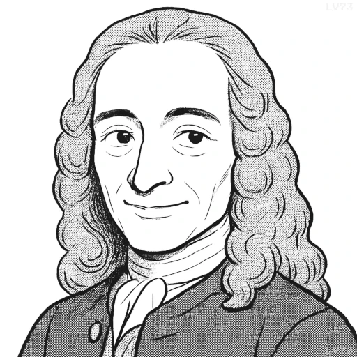
- November 21, 1694 – May 30, 1778
- Born in France
- Philosopher, man of letters, historian
table of contents
Quote
“The little may contrast with the great, in painting, but cannot be said to be contrary to it. Oppositions of colors contrast; but there are also colors contrary to each other, that is, which produce an ill effect because they shock the eye when brought very near it.”
Explanation
This quote reflects Voltaire’s understanding of aesthetics and contrast, particularly in art. He distinguishes between contrast and contradiction, suggesting that while smaller or simpler elements can contrast effectively with larger, more complex ones, they do not inherently oppose or diminish each other. However, in color theory, he acknowledges that some colors can be too jarring when placed too close together, creating a visual “shock” rather than a pleasing contrast. Voltaire’s words highlight the importance of balance and harmony in both artistic composition and the use of contrasts.
In modern contexts, this idea resonates with design principles and the idea of balance in both visual arts and broader concepts. For example, in interior design, the use of contrasting elements—such as modern and traditional pieces—can create interest without being contradictory, while clashing colors or overly aggressive contrasts can create visual discomfort. Voltaire’s quote suggests that contrast, when done thoughtfully, adds richness and depth, but unchecked extremes can be detrimental to the overall effect.
A specific example of this principle can be seen in graphic design or fashion, where contrasting elements like bright colors or bold patterns are often used to create visual impact. However, using too many opposing elements or harsh colors together can overwhelm the viewer and create a dissonance. Voltaire’s words serve as a reminder of the delicate balance between contrast and harmony in aesthetics, where extremes can be effective only when carefully managed.
Would you like to share your impressions or related stories about this quote in the comments section?